Plotting
Dionysus includes simple plotting functions, in module dionysus.plot, to
visualize persistence diagrams. These functions internally use Matplotlib, so it has to be installed.
First we generate some diagrams (Vietoris–Rips complex of a 100 random points in a square):
>>> points = np.random.random((100, 2))
>>> f = d.fill_rips(points, 2, 1.)
>>> p = d.homology_persistence(f)
>>> dgms = d.init_diagrams(p, f)
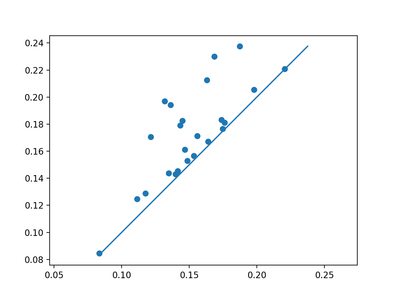
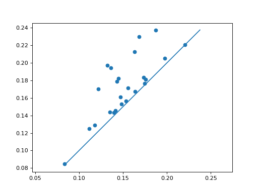
We can scatter plot the points, using plot_diagram().
>>> d.plot.plot_diagram(dgms[1], show = True)
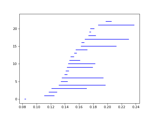
Alternatively, we can look at the barcode, using
plot_bars(). It’s possible to reorder the bars by death,
by passing order = 'death' to the function.
>>> d.plot.plot_bars(dgms[1], show = True)
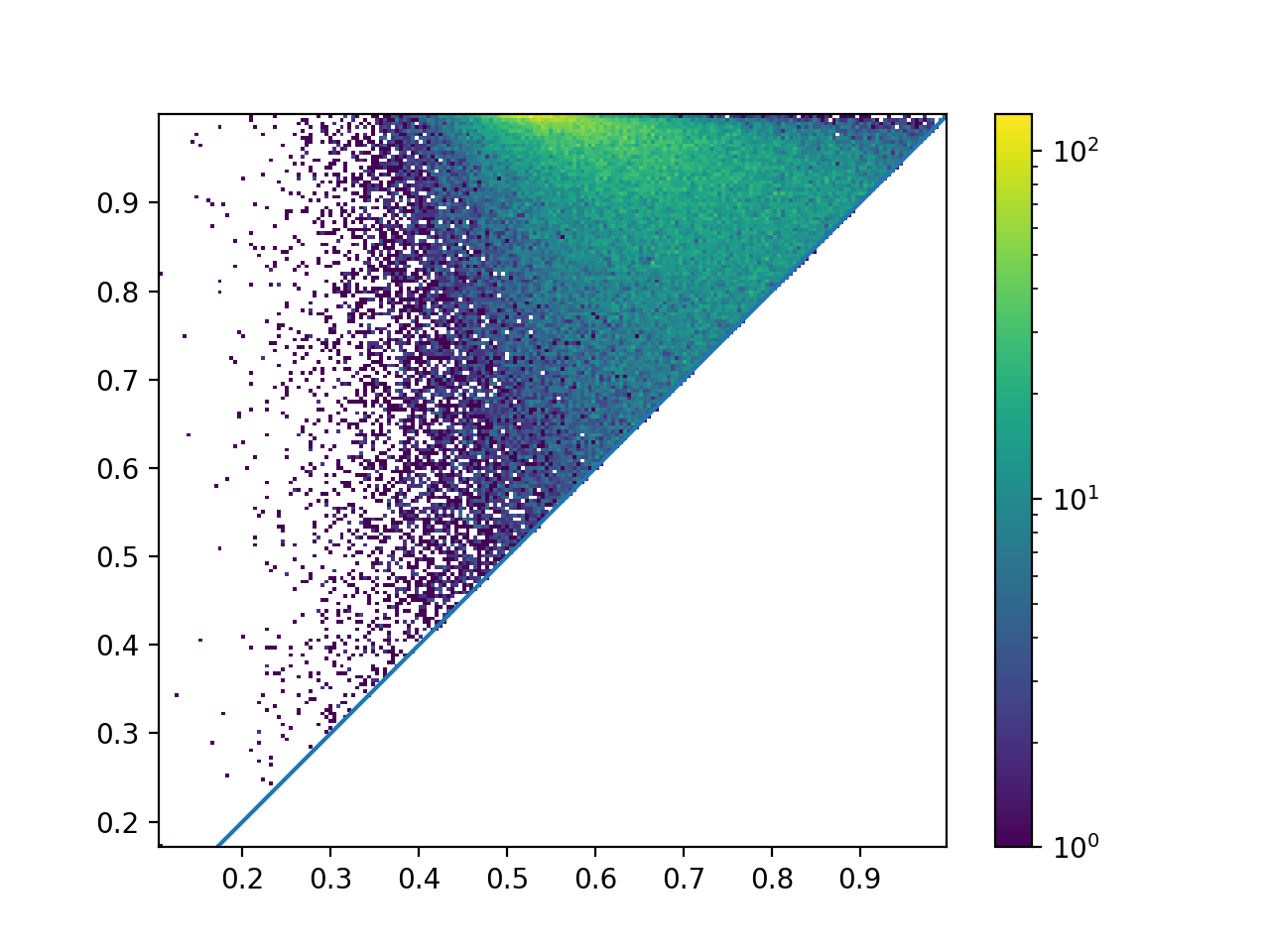
When the diagram is very dense, it’s often convenient to look at the histogram
of point density, using plot_diagram_density():
>>> a = np.random.random((800,800))
>>> f_lower_star = d.fill_freudenthal(a)
>>> p = d.homology_persistence(f_lower_star)
>>> dgms = d.init_diagrams(p, f_lower_star)
>>> d.plot.plot_diagram_density(dgms[1], show = True)
